Appearance
Colours, named themes, your own CSS and JavaScript, the sign-in page and an installable app.
Appearance
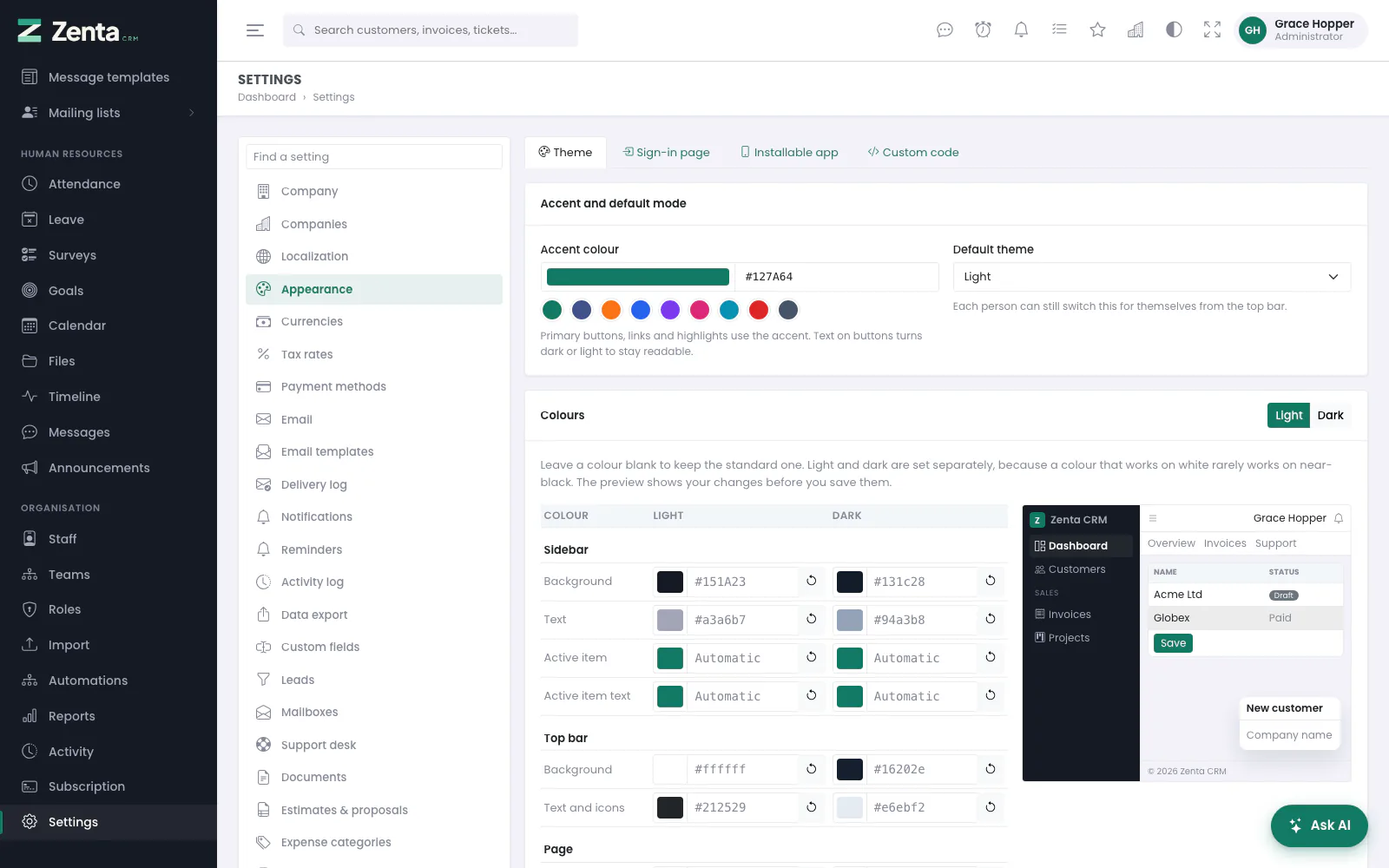 The theme editor. Every colour is a token, so the whole interface follows.
Settings → Appearance has four tabs: Theme, Sign-in page, Installable app and — for administrators only — Custom code. Everything here belongs to the workspace: in SaaS mode each workspace has its own colours, themes, sign-in page and app.
Getting around the panel
The menu down the left has a section for each part of the product. Opening one closes whichever was open, and the section holding the screen you are on opens itself when the page loads.
The three lines at the top left narrow the menu to a rail of icons, giving the page another 180 pixels. Hovering an icon on the rail flies that section's links out beside it, so nothing becomes unreachable. The choice is remembered in your browser and applies before the page is painted, so the menu never jumps on load — and it is yours alone, not the workspace's.
On a screen narrower than 992 pixels the menu becomes a drawer over the page: the same three lines open it, following a link or pressing Esc closes it again. On a phone the top bar also sheds its two shortcuts — the starred menu, and your personal list, which moves into the account menu under your initials.
Under the top bar, every screen carries a band with its title, the trail back to where you came from, and that screen's own buttons.
Theme editor
The top card, Accent and default mode, holds the Accent colour — primary buttons, links and highlights; the text on buttons turns dark or light by itself to stay readable. Pick it with the swatch, type a hex value, or click one of the nine ready-made colours under the box. Beside it is the Default theme (light or dark). Each person can still switch between light and dark from the top bar; that choice is theirs and is remembered in their browser.
The Colours card lists every colour you can change, with a column for light and a column for dark:
| Section | Colours |
|---|---|
| Sidebar | Background, text, active item, active item text - in the staff area and the customer portal |
| Top bar | Background, text and icons - in the staff area and the customer portal |
| Page | Page background, cards and panels, text, secondary text, borders |
| Navigation bar | Background and links of the public pages' top bar |
| Footer | Background and text of the staff area and portal footer |
| Modals | Background, header |
| Tables | Header background, header text, row hover and stripe |
| Tags and badges | Background and text of the neutral (grey) badges; green, amber and red badges keep their meaning |
- Pick a colour with the swatch, or type a hex value such as
#1e293b. - Watch the preview on the right. It switches to light or dark as you edit a column; the Light and Dark buttons above it switch by hand.
- Press Save changes. The whole staff area, the portal, the sign-in and the public pages take the new colours.
Named themes
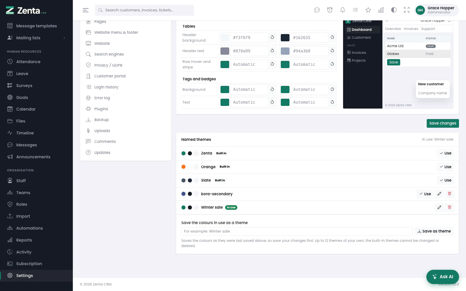 Named themes: three built in, the workspace's own below them, and the one in use marked.
Under the editor is a list of named themes. Three are built in and can be neither renamed nor deleted: Zenta (the colours the product ships with — a Jade green accent and a near-black Ink sidebar), Orange (the warm accent and light sidebar the product wore before) and Slate (a neutral grey accent with a dark sidebar). The theme in use is marked.
The card's heading says which theme is in use — or your own colours, not saved as a theme once you have changed anything since.
- Save the colours in use as a theme: type a name (up to 60 characters) and press Save as theme. It keeps the colours as they were last saved — save your edits first — and becomes the theme in use. You can keep up to twelve themes of your own.
- Use makes a theme's accent and colours the workspace's, after you confirm (Colours that are not saved as a theme will be replaced). Save them as a theme first if you want them back.
- The button opens Rename theme: change the Name and press Save. Built-in themes cannot be renamed.
- The button deletes one of your themes, after you confirm. Deleting the theme in use changes nothing on screen — only the name goes. Built-in themes cannot be deleted.
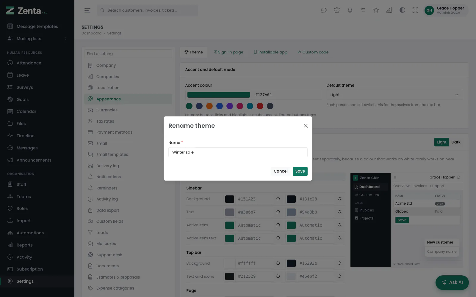 Renaming a theme of your own.
Light and dark mode are not part of a theme: every theme has a light and a dark set of colours, and each person picks the mode.
Sign-in page
 The sign-in page tab: what staff and customers see before they sign in.
The Sign-in page tab covers the staff sign-in, the customer portal sign-in and the password reset pages, and the bar across the top of the public pages. Press Save changes to keep what you change.
- Logo — shown here for reference; Change them goes to Settings → Company, where they are uploaded. The logos replace the initial and name on the staff and customer sign-in pages. With both a light and a dark logo, each shows in its own mode.
- Favicon — the favicon uploaded under Settings → Company is used on every page: staff area, portal, sign-in, public pages and error pages. Without one, the bundled icon is used.
- Background picture — PNG, JPG or WEBP up to 2 MB, shown full-screen behind the sign-in box on the sign-in and password reset pages. Choosing a new one replaces the old. Remove picture takes it away again, after you confirm, and the file is deleted.
- Welcome text — up to 500 characters of plain text under the heading on the staff and customer sign-in pages.
- Show the top menu on public pages — switch off to hide the bar across the top of the knowledge base, the support form and the other public pages, for example when you link to them from your own website, which has a menu already.
Installable app
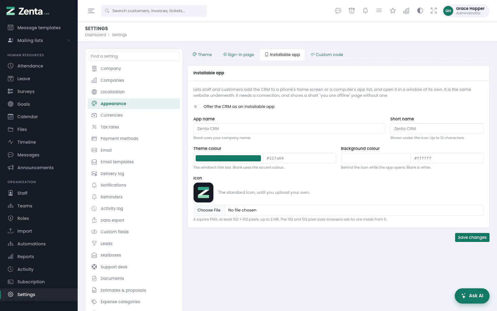 The installable app tab. Off until you switch it on.
Switch on Offer the CRM as an installable app and browsers offer to install it: on a phone as Add to Home screen, in Chrome and Edge on a computer with the install icon in the address bar. It then opens in a window of its own, with your name, icon and colours. Staff land on the dashboard, customers who install it from the portal land in the portal.
| Setting | What it does |
|---|---|
| App name / Short name | Shown on the splash screen and under the icon. Blank uses the company name; the short name is at most 12 characters. |
| Theme colour | The colour of the app window's title bar. Blank uses the accent. |
| Background colour | Behind the icon while the app starts. Blank is white. |
| Icon | A square PNG of at least 512 × 512 pixels, up to 2 MB. The 192 and 512 pixel sizes browsers ask for are made from it when the server has PHP's GD extension; without GD the picture is used as uploaded. Without an upload, the bundled Zenta CRM icon is used. |
Press Save changes. Once an icon of your own is uploaded, a Remove button beside it puts the standard icon back, after you confirm (Go back to the standard icon?); the uploaded file and the sizes made from it are deleted.
https://; the
settings page warns when it was opened over plain http. The app is the same
website underneath: without a connection it shows a short "You are offline"
page. The service worker keeps nothing from anybody's account — only that
page and the product's own files under /assets; pages, forms, the
API and uploads always come from the server. Switching the app off makes the
worker clear its cache and remove itself the next time a browser checks.
Custom code
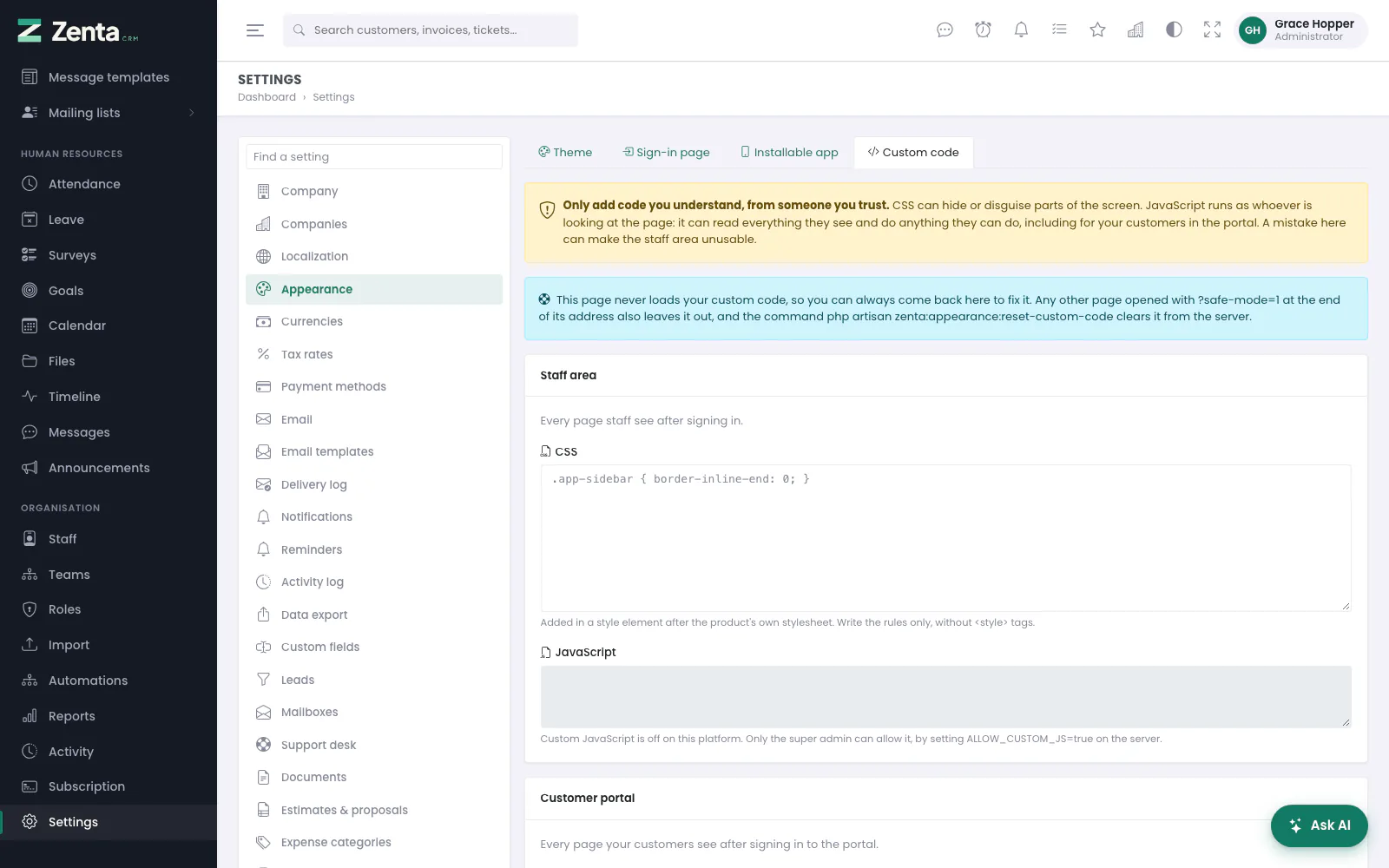 Custom code, for administrators. Here JavaScript is refused by the server, so its box is greyed out.
Administrators can add their own CSS and
JavaScript, separately for the staff area and the
customer portal. Write the rules or the code only, without
<style> or <script> tags. CSS is added after the
product's stylesheet; JavaScript runs at the end of every page, after the
product's own scripts. Press Save changes. Each box holds up to
15,000 characters. Custom code is
never added to the sign-in pages, the public pages, the tenant admin area, error
pages or the installer.
Whether JavaScript may be added at all is decided on the server, with
ALLOW_CUSTOM_JS in .env:
| Install | Default | To change it |
|---|---|---|
| Single company | Allowed | ALLOW_CUSTOM_JS=false turns it off |
| SaaS mode | Refused | Only the super admin can turn it on, with ALLOW_CUSTOM_JS=true. It then runs for every workspace that adds some — for that workspace's own staff and customers. It never runs for the super admin: not when they open a workspace, and not while impersonating someone in it. |
While JavaScript is refused, the script boxes are shown greyed out; a script stored earlier is kept but does not run.
If custom code breaks the screen
- Open Settings → Appearance → Custom code. That page never loads your custom code, so it always works; empty the box and save.
- Or add
?safe-mode=1to the address of any page to open it without custom code. - Or, from the server:
php artisan zenta:appearance:reset-custom-codeclears all four boxes. In SaaS mode add--workspace=<id or slug>, or--allfor every workspace.
Addresses on this page
For reference and for anyone scripting against the panel. Everything here needs somebody signed in to the workspace whose role allows it; anybody else is refused.
| Method | Address | What it does |
|---|---|---|
GET | admin/settings/theme | The Theme tab: accent, default mode, colours and named themes. |
PUT | admin/settings/theme | Saves the accent, the default mode and the colours. |
POST | admin/settings/theme/named | Saves the colours in use as a named theme. |
POST | admin/settings/theme/named/{id}/apply | Use: makes a named theme the workspace's colours. |
GET | admin/settings/theme/named/{id}/edit | The Rename theme form, in a pop-up. Not for built-in themes. |
PUT | admin/settings/theme/named/{id} | Renames a theme of your own. |
DELETE | admin/settings/theme/named/{id} | Deletes a theme of your own. The colours in use stay. |
GET | admin/settings/appearance/sign-in | The Sign-in page tab. |
PUT | admin/settings/appearance/sign-in | Saves the background picture, the welcome text and the public top menu switch. |
DELETE | admin/settings/appearance/sign-in/background | Remove picture: deletes the sign-in background. |
GET | admin/settings/appearance/app | The Installable app tab. |
PUT | admin/settings/appearance/app | Saves the app switch, names, colours and icon. |
DELETE | admin/settings/appearance/app/icon | Remove: deletes your icon and goes back to the standard one. |
GET | admin/settings/appearance/code | The Custom code tab. Administrators only. |
PUT | admin/settings/appearance/code | Saves the four CSS and JavaScript boxes. Administrators only. |